
Color Matters: Design:Color for E-Commerce
Regardless of how we define commerce, almost every web site is selling something. It may be a one person accounting business, it may be a site that sells only tanning products or a much larger department store. Even educational sites could be considered commercial if they must generate advertising income.
A successful “store” has a simple formula. Initially, it must be accessible to everyone. It must be attractive and inviting. Once inside, the customer must be able to move comfortably through the store and find what they need. They must be able to examine the merchandise (or service) and get information about it. Finally, they must be able to successfully complete a purchase or procure a service.
For the first time in history, a flat surface electronically simulates a physical \"bricks and mortar\" store. In spite of the limitations of this digital medium of images and text, the same formulas for success apply — and even more so.
Color must function successfully on several levels simultaneously. First, on a technical level, the colors must be as accurate as the existing technology will allow, while, at the same time, heeding the rules of optics. Second, once a set of colors has caught and held the visitor\'s attention they must succeed in conveying appropriate information. Third, colors must function competently as the primary structural element in the store’s design — the web page layout. In this capacity, color must create appropriate spatial and navigational effects on the page and the site as a whole. Fourth, as the primary aesthetic tool, colors must create a sense of visual harmony, thus sustaining and enhancing the customers interest in the shopping experience.
1. Convert images to the correct file format.
This not only delivers the best colors and the best images possible but it also lowers file sizes and shortens the download time.
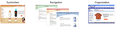
2. Select the most appropriate colors by analyzing the store’s products or services and the target market. It is essential that colors bear some relationship — either symbolic or literal — to the product or service. Don’t try to reinvent the color wheel by using unusual colors.
3. Use color to create the most functional user-interface design. For example, use color to direct the eye to the most important areas on the page. The web designer must identify what ideal and normal sequences might entail: what the viewer should see first, where the eye should move next, and how much time the viewer\'s attention should be held by each area. Keep colors to minimum. \"Signal detection\" theory means that the brain is able to understand and organize information when a minimum of colors and shapes exists within the visual field. Too many colors and shapes make it impossible to focus and find anything.
4. Use color harmony principles to create a pleasant visual experience. In other words, all the colors of the components — the navigation system, banners, buttons, and text — as well as the images of the merchandise (if they exist), must all work well together. Some common attribute must unify them.
In conclusion, consider this: Just as a store is constructed of solid matter, color is the basic building material of two-dimensional images and visual experiences. In the final analysis, color plays a pivotal role in the customer’s critical decision — to buy or not buy.
Related Article
destination source:https://akvis.com/en/articles/color-and-design/color-for-ecommerce.php

